Guide to FrameLink > Visual elements
A FrameLink application has all the information you need for a particular project. Each of the square cards on the right side of the vertical black bar is an access to a FrameLink table - a kind of traditional spreadsheet with rows and columns you can organize at your will.
These Cards are grouped in modules. If you select a diferent module in the black vertical bar at left, you will see a diferent set of Cards. For example, on a sales pipeline project you could be organized in several modules one with separate tables for companies, contacts, contacts within each opportunity, type of business etc, a second module with tables for opportunities, actions, proposals and so on.
The Dashboard
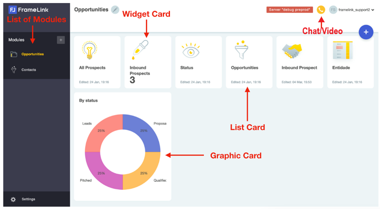
This is a FrameLink Dashboard. FrameLink has some simple visual elements that we frequently mention in this guide. The first element is the Card. A Card is a visual element that gives you access to a FrameLink table or to a FrameLink calendar. Later on you will see that FrameLink cards can be graphics or widgets with some summary information about the tables they give access to. Cards are grouped in Modules (in the black vertical bar)
Creating a new table
With FrameLink you can deal with your data with a minimum preparation. You do not need to define upfront a set of tables each one with a set of fields before introducing data into FrameLink. Only one rule applies: your data should be created within a table. Create a table from scratch clicking the big blue plus icon in the dashboard or import existing data from a spreadsheet by clicking the cog iconcog and selecting Import Spreadsheet.
Once you’ve created your table, it’s time to add (click the edit icon) all the information you want to organize as records. While you are adding information you can add fields if the information does not fit in existing ones while adjusting field headers to make your information clearer.
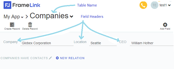
Basic transformations - Change Table & Field Names
Edit the Table name by clicking it and change it in-place. Edit any Field name (column headers) simply by clicking it and changing it in-place. Notice that when you click any column header the icons above the line of headers change. The left most icon corresponds to the currently selected field interface and you may change it to any of the interfaces that are available in the horizontal menu above the header's row. These transformations can be done in Field Mode - when we do someting specific to a column such as changing its interface or removing the column - or Outside Field Mode when we want to add a new column to the table.
Users with Designer permissions will be able to enter Field Mode simply by clicking the header of the column they want to change. They can exit Field Mode by clicking anywhere outside any column header.
Notice that the default operation mode is Outside Field Mode - Field Mode is only accessible to users with "DESIGNER" permissions.
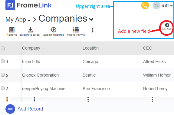
The first elementary operation a DESIGNER will want to do, is to add a new column to the table. To execute it, click outside any column header and notice the upper right area icons:
Click the Add Field icon. A new column with header "New Field" will appear at the right side of the last existing column.
You can drag the column to whatever position you prefer simply by hovering the header and dragging the cross icon that will appear.
You also can change the size of any column by getting the separator of any two columns and drag it to the position you want.
To change the interface of any column or simply remove it from the table, click the header of the column: Notice the horizontal list of possible interfaces at left and above the line of headers. The leftmost position is the actual interface. Click the new interface and it will move to the left most position.
To remove You can drag the column to whatever position you prefer simply by hovering the header and dragging the cross icon that will appear.
You also can change the size of any column by getting the separator of any two columns and drag it to the position you want.
In List Mode, as soon as your mouse hovers a row, notice that it will become sligthly darker and that a Trash Bin and a Zoom Lens will appear at left.
The Trash Bin is the icon you should click, if you ever want to delete that row.
The Zoom Lens is the icon you must click to enter Zoom Mode, where you will see the content of that row isolated in the screen. The Zoom Mode is particularly important in FrameLink because it is the point where you see the relations between a given record and any other records in other Framelink Tables.
Entering Zoom Mode
In Zoom Mode you see all fields from the current 'zoomed' record.
In Zoom Mode you can edit any existing data field, just click it and editing it.
Just like List Mode, also in Zoom Mode if you have Designer permissions you can edit the Table name and any field header.
In Zoom Mode you change the field interface of any field by clicking it and selecting any of the available interfaces in the horizontal list of icons that will appear below the table name.